
Introduction
In data analytics, the ability to present data in a visually appealing and easy-to-understand format is essential. Visualizations and dashboards provide a way to quickly comprehend complex data sets and identify trends, insights, and patterns. With the latest tech stacks and data, it is possible to build unique and interactive visualizations and dashboards that can enhance decision-making, problem-solving, and communication.
A Healthcare Use Case
One such example of an innovative and informative dashboard is the COVIDemic dashboard project our Business Intelligence Unit took on during COVID-19. The dashboard provides detailed insights into the spread and management of COVID-19 worldwide. It is built using the latest tech stacks and data analytics tools, including Python and D3.js visualization library.
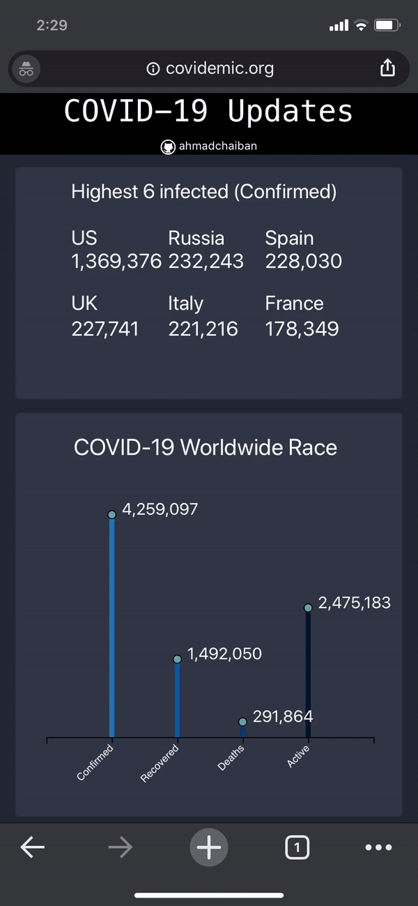
The dashboard comprises seven graphs representing various aspects of COVID-19 data. These graphs include the Top 6 confirmed cases, the COVID-19 Worldwide race, the Percentage of the world infected, The World Heat Map, Daily latest cases, Confirmed/Active/Recovered/Deaths per day (Top right histogram), and a Total number of Confirmed/Active/Recovered/Deaths aggregated per day (Bottom right Line Graph).
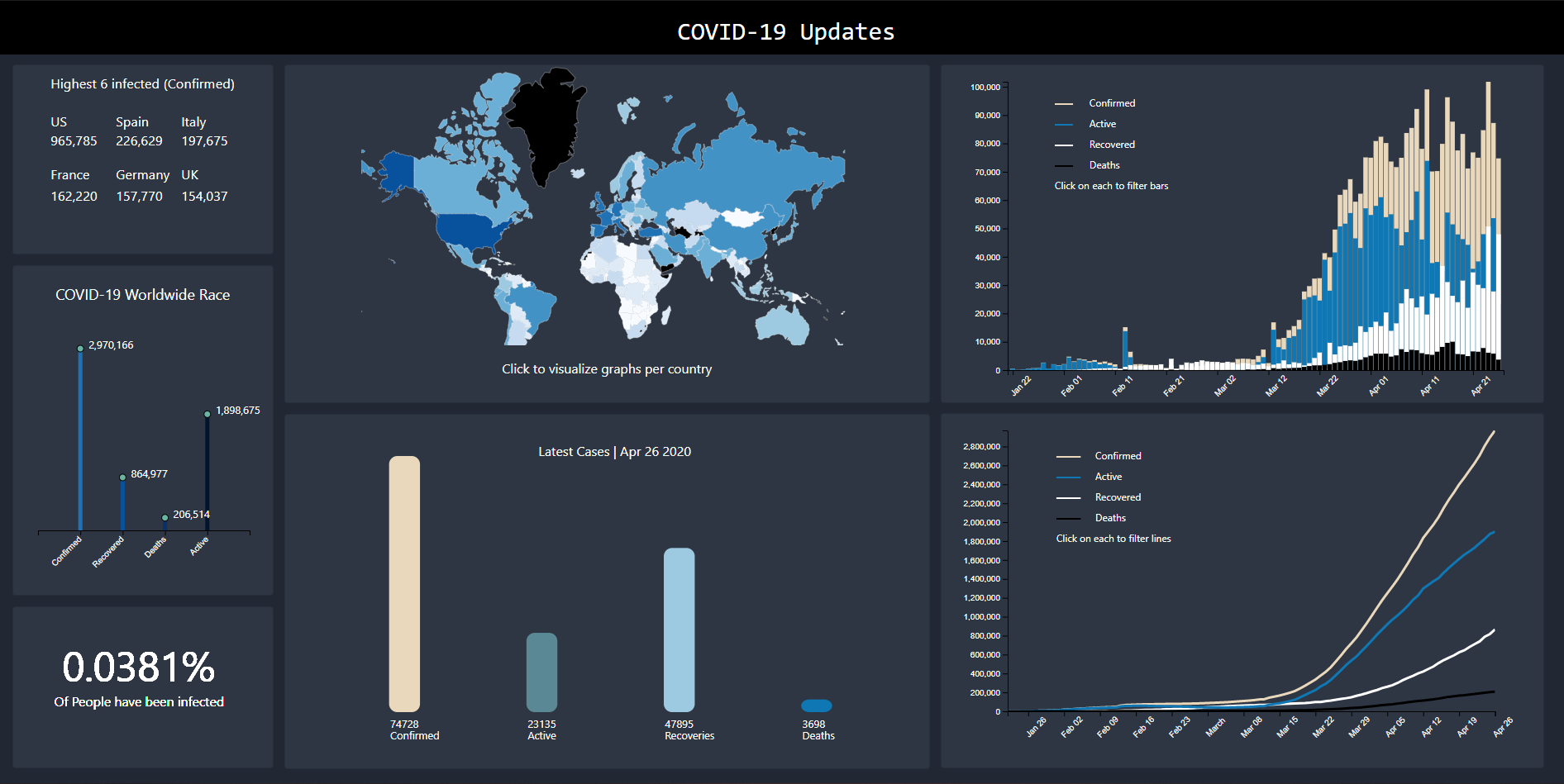
One of the most notable features of the dashboard is its interactivity. Users can zoom in and highlight specific regions on the main world map by tapping (on mobile) or hovering with a mouse. Clicking/tapping on any country on the map allows users to view all graphs by country. Users can also toggle the lines/bars they want to see by clicking on the legend text. Clicking the reset button returns users to the worldwide view of the graphs.
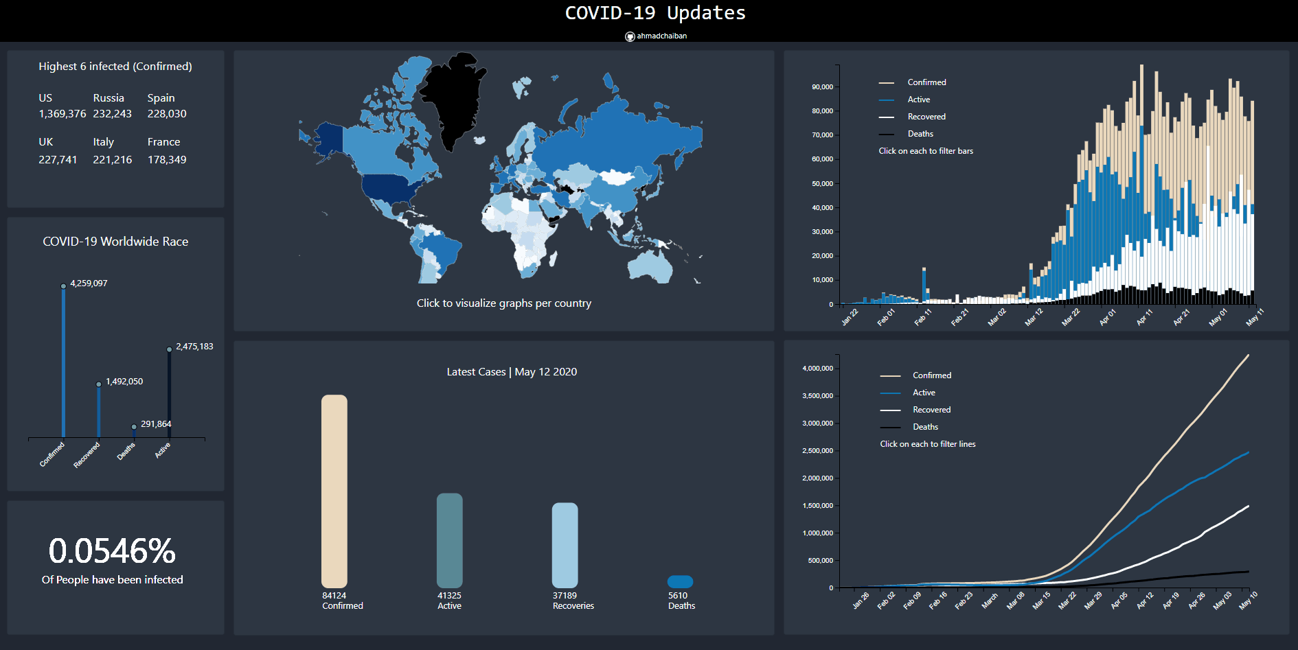
The COVIDemic dashboard uses various tech stacks and data analytics tools to provide users with an engaging and informative experience. The data is sourced from the GitHub repository, which provides the primary data that is later processed and aggregated using Python scripts running every hour on an Amazon EC2 server. The D3.js visualization library is used to create the visualizations and graphs displayed on the dashboard.
The dashboard is designed to be accessible and user-friendly, with a mobile version that offers all the same functionalities as the desktop version.
Conclusion
In conclusion, the COVIDemic dashboard is an excellent example of how the latest tech stacks and data analytics tools can be used to create unique and interactive visualizations and dashboards. With data becoming increasingly complex, visualizations and dashboards are essential tools for businesses, governments, and individuals alike to make informed decisions and understand complex data sets.